Showing posts with label Advertising. Show all posts

Saturday, February 23, 2019

Persuasive Wordplay in Animated Email Advertisements

Animated email advertisements by Google. An incredibly well-known company, which began as a search engine but now houses an entire suite similar to that of Microsoft Office. The following advertisement is for their advancement into becoming something of an "all-in-one" company, similar to Apple's "Siri," "Google Assistant" is an assistant to help people complete tasks by only using vocal commands. However, let's see how their advertisement compares to our standards.

Google Assistant Advertisement - Overall Grade: A

ANIMATED:


The animated portion of their advertisement is extremely well made for email-based marketing approaches. Firstly, it's a small portion of the email that's fully animated, creating smaller file size, and therefore, a shorter loading time. 

The pretense of this advertisement is the sentence, "Have Google -blank- it." Putting different words in place of this "blank" is effective in that it's able to give examples of what the audience can do with this specific product. In giving multiple different uses for the Google Assistant, more people will buy into the idea of using it, because they can see a practical use for the product. Having the text move quicker and quicker as the animation goes on before replacing the changing verb into the slogan is smart because it gives the audience a sense of there being many, many more options available, and that there isn't enough time to look through them all. This is smart as a way to also lead into the ending, where the slogan appears.

The bold statement of "Make Google do it" is extremely effective in that it's able to very simply explain what the entirety of the animated advertisement had been trying to say; essentially, that Google, or Google's Assistant, can do anything you ask it to, and that all you have to do is tell it to do so. It's a smart way to tell the audience that they need to "Make Google do -blank-" in a way that doesn't sound like a command. If it were phrased that way, fewer people would be inclined to listen, even just a little bit, because people don't like being told what to do. However, with the email advertisement saying that they should make Google -blank- it, the audience doesn't feel as if they're being commanded, but that they can tell Google what needs to be done.

To finish off the animated advertisement with the logo for Google's Assistant is extremely smart, especially coupled with the fact that it is the only color in the entire animation. Having it be the only splash of color helps to make the logo stand out, as well as making sure that the audience remembers it from the animation. Considering the logo is also used within Google Assistant itself, it's good that it's in the advertisement to give the audience and customers a tie-in to the product itself.

STATIC:


The rest of this advertisement is great, considering that it came up in time for spring. The imagery of someone pruning a tree, getting it healthy for spring, is not only a great juxtaposition of the monotony of black, grey, and white (minus the Google Assistant logo, of course), but it also brings in the color green as a focal point, which is not only associated with nature and life but also money and wealth, slightly inspiring imagery of Google Assistant being a product that will help someone's life be prosperous. "Spring into action" is a really cute way to blend in the time, and give a reason to begin using Google Assistant, which we'll mention soon. Through the statement, "tidy up and make way for what matters most with help from your Google Assistant," one can assume that the email advertisement is alluding to the fact that, in spring, many people participate in spring cleaning, in order to have a clean start for the rest of the year. This can also be helped through the fact that they're advertising a completely hands-free version of the AI, meaning that the audience can be cleaning with their hands, and begin searching things, create reminders, and more, simply by saying a vocal prompt. 

The final part of the email advertisement states that Google Assistant can be available across different devices, which not only helps sell their product to people who maybe have multiple devices that support Google Assistant, or at least, try to send a subconscious message for people who don't have multiple devices, to perhaps look into buying some for the upcoming seasons. 

Overall, the grade I've given is simply because I believe that every aspect of this animated email advertisement is absolutely wonderful. The subtle psychology behind the wording of the slogan, the color aspects of the animation, the color of the static image below, the wordplay on the season, and the slight advertisement at the bottom; everything works cohesively together, and it's orchestrated into a beautifully simple, yet complex advertisement that is succinct and persuasive.

Thursday, April 12, 2018

Animated Email Advertisements and Color Theory

We continue our examination of animated emails from top brands by taking a look at Olive Garden's National Breadstick Day advertisement. Olive Garden is a well-known restaurant known for its home-style attitude, its never-ending garlic breadsticks, and its amazing salad dressing. The following email advertisement was for National Breadstick Day, trying to get their newsletter followers to "celebrate breadsticks" at their nearest Olive Garden.

Olive Garden National Breadstick Day Advertisement - Overall Grade: B-

ANIMATED:


This specific advertisement is alright. The animation itself is choppy, almost looking like stop-motion, which could potentially be in order to add to the homemade feel that the restaurant likes to advertise. The way that the breadsticks are crawling off the plate is definitely a plus, though, because it seems to imply that everyone at the table is taking the breadsticks and that everyone wants some. The composition of the advertisement is very good, though, having the plate of breadsticks in the center as if the reader were looking down at their table, then having their signature salad in the upper lefthand corner and what looks like a soda in the upper right. 

Having the colors of the letters be the light green that they are is both aesthetically pleasing against the dark brown of the table, and is great at connecting the entire piece together as it's the same color as the salad in the upper lefthand corner. The alternating brown color is good as it also connects to the brown wood of the table the plates and whatnot are sitting on, and as a good contrast to the white plate. This is all ignoring the fact that the new logo is made with the same colors, however, and the colors could just be exact color drops from that. The same logic could be applied to those colors being chosen for the logo as well, though. Green is usually associated with nature and freshness, which are good to think of with a restaurant that has a very memorable salad appetizer. Not to mention that it's associated with growth and money, possibly subconsciously telling their customers that they are a very successful company and that they're a good choice to go to. The brown is effective in sharing the idea that the restaurant is friendly, which is a selling point in most of their advertisements as well.

STATIC:


The message below is very clever. Most, if not all, of Olive Garden's audience, love their signature breadsticks, and the company is capitalizing on that. By saying that "one breadstick is never enough," Olive Garden is subconsciously telling its audience that they need to eat multiple breadsticks to feel satisfied, which is good, considering that the restaurant gives unlimited servings. Even the button at the bottom is useful with this, by bringing home the entire advertisement and reminding the audience why it was sent out. By stating "celebrate breadsticks" on the button to the website, they both remind the audience that it's National Breadstick Day, but also make them crave exactly what they're trying to sell.

The grade I've given is derived from the overall placement of the components and the design of the advertisement, but not the animation itself. Even if the point of having the choppy animation was to add to a homemade, stop-motion feel to the advertisement, it seems lazy and uninteresting. The composition and colors were nice, as well as the written message below, which definitely helped boost the grade a bit. Although, no matter the interesting thought development behind it, and the message it may have, this advertisement doesn't make me feel as though I need to go out and get some breadsticks alongside some Olive Garden Italian food, even if it was National Breadstick Day.

Monday, March 26, 2018

Animated Email Advertisements are Instinctively Interesting

As people who frequent pizza delivery services may have heard, “No One Out-Pizzas the Hut.” Pizza Hut is a well-established company with over 11,000 stores across the world, with thousands of people subscribed to their emailing services to gain coupons and the newest, freshest information about the company. With so many people to reach out with simply email, Pizza Hut stepped up its game in October of 2016 with an animated Halloween email promotion.


Pizza Hut Halloween Advertisement - Overall Grade: B+


ANIMATED:


This advertisement is simple, yet effective, especially for parents wanting to host Halloween parties or events. It grabs attention immediately by being extremely dark, contrasting a usually red and white color scheme that Pizza Hut uses almost universally as with their branding. The black is also a considerate contrast to the Halloween orange that is usually used in branding in October. Once the audience is looking, either the bright red text at the bottom will have them reading, or the scary animated red eyes that seem to pop out of nowhere will have them looking at the ad for longer than if it were simply a still image. The animated leaves that move across the image from right to left also keep the audience interested, and if they’ve finished reading the text, bring their eyes back to not only the image of the door but also the beginning of the text. A good addition to this advertisement would be perhaps having the door open slightly, or maybe having it slamming shut after the eyes look around, maybe adding creaking noises or a growl of some sort. I gave this animated advertisement a B+ for its creativity in design for a Halloween advertisement, and the quality of the animation that they’ve included. The best way to improve, in my opinion, would be to add extra movement to keep the reader’s focus for longer or to keep it memorable.  

STATIC:


The effectiveness of this advertisement would be lacking if it were just a still image instead of an animation because some would simply look and move on, perhaps not even reading the text on it. However, with the small moving details, the brain gets distracted and will look to see what information it’s missing that’s causing the movement to happen.

The benefits of having animation in email marketing are more than just eye-candy, it’s psychology, and while I won’t go into too much detail here, it’s similar to what I just stated. Our brains instinctively see motion in order to protect ourselves, so when there is a static image, our brains will more likely ignore it in favor of one that’s moving.

This opens up a world of opportunity with our advances in technology, especially for the best marketing advancements. While some are content with static billboard images, innovators are creating interesting animated email advertisements. As these types of animated email ads are produced and become more mainstream, the importance then turns to not only if an advertisement is eye-catching, but also if it’s pleasant to look at, if it keeps the reader’s attention, and if it evokes the correct response out of who the company is trying to reach. With all of these attributes in mind, creative marketing strategies such as making interesting animated email advertisements such as the Pizza Hut one above are not only effective because they might look cool, but they have a psychological reason to do so. It is only through tactics such as these that the companies willing to keep up with the ever-changing field of marketing will be able to flourish.     


Sources:

Wednesday, November 6, 2013

Brand Experience

Castle Business Solutions asked Oevae Marketing Consultants to design a full page ad for a Gala event. Castle provided a sample of their recent newsletter for reference.

We know that whatever you are trying to say must be consistent and clear if you really want to get your point across.  In fact at Oevae, we believe that there should be a rhythm to your brand- a constant.

In this case tagged #GalaAd, the full page ad (fig. 1) for the Gala event (8X10) was created by borrowing from the colors found in the Castle Business Solutions newsletter (fig. 2). This includes base color, accent color, and trim color pallet.

This project was produced on-time and within 24 hours (Friday/Monday).

We chose to highlight the services offered by Castle with a splash of colors for the "Gala" which celebrated it's 40 year anniversary, yet target the core service offers.  The Gala ad appeals to both right/left brain in a pleasant, constant format that reinforces the Castle Business Solutions branding.

The client sent the following comments:
Love It! Looking forward to a long term partnership.  We are so proud of our Ads! Thanks to you and your crew!     – Sharon

Castle Business Solutions Gala Ad 

fig. 1

Castle Business Solutions Newsletter

fig. 2

You need a solution for creative, you want to reduce the amount of time it takes to produce creative marketing communications.  You can choose to use a template or you can make sure your branding delivers the clear and creative experience for your next ad – you'll want to choose Oevae.

-->
created at TagCrowd.com

Saturday, January 23, 2010

What is Demographically Correct Marketing?


Marketing by demographic is an effective way to reach the right audience for your product or service and create a targeted marketing campaign. Demographic marketing will include multiple forms of media like social media (Facebook, Twitter, TikTok, Google, etc.), text messaging (SMS), print, Linear TV, and perhaps the highest return on investment when mixed with OTT (Over-the-Top streaming media), CTV (Connected TV), or Radio.

Granular demographic data is paramount

Before we delve into the candy box of ideas, you should first understand and clearly define the specific demographic groups (ethnicity, gender, political beliefs, age, region, morals, etc.) to intend to address and essential for successful marketing efforts, because no message will appeal to everyone.  When you have a clear belief of who is most likely to find your brand appealing, only then should you start tailoring your marketing message, as well as your marketing medium.

Different demographic groups respond to different types of messages

Children, youths, tweens, teens, and seniors will respond differently to a TikTok (short-form video hosting allows users to watch, create, and share 15-second videos shot on cellphones) ad.  Primarily because many seniors do not strive for continuous "stimulation" like a teen which is key to brain development. Not to mention the language, slang, and desires are often completely different.  What the teen considers cool, the senior may see as a distraction.  In fact, a senior may not even access the TikTok app or even have a mobile phone, whereas the latter will have a TikTok t-shirt and the app on their Apple or Android home screen.  

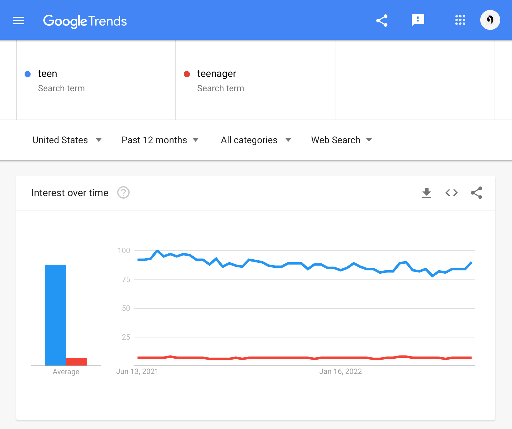
For example, Google Trends shows that the search term "teen" is clearly more popular than "teenager" as a search term in the United States. 

Interest over time on Google Trends for teen, teenager - United States

Interest over time on Google Trends for teen, teenager - United States


Avoiding social and cultural stereotypes, and paying close attention to body language and idiomatic language quirks will help you prevent unwitting insults, missteps, and or mistranslations.

Choose prominent mediums for marketing messages


If you've clearly broken down your demographic and the message you want to distribute, the next step is knowing which media you need to use. I mentioned TikTok earlier, however, it's certainly not the medium of choice for everyone.

"Teens and young adults get most of their information online, so Internet advertising is a smart way to reach them. If you offer a product that appeals to an intellectual audience, you are more likely to reach them by sponsoring public radio than by advertising on a pop music station."

– Devra Gartenstein, AZ Central


Hootsuite reports that Facebook aka Meta has 2.82 billion daily active users, so understanding Facebook demographics is key to creating successful marketing messages.  Obviously, each of those active users is not worth spending your marketing budget most effectively, so it's extremely important that you purchase advertising through the types of media that your target market uses.

Send a clear message about your business with confidence

Using demographics to tailor your marketing messages has the advantage of understanding and appealing to your target customers, however like most things in life, it is not without its limitations. If you sell a product with a potentially broad appeal but limit your marketing message to attract a single demographic, you may alienate other potential customers.

Oevae has 20+ years of offering creative marketing services filled with satisfied clients. That's because Oevae can highlight the unique differences and qualities your brand brings to the market in ways that resonate with consumers' desires. Enhance your brand image, equip your staff, and launch your business with more efficiency and effectiveness.

Make a brand difference.™


Tuesday, September 15, 2009

How to add substance and meaning to your logo


I don't remember a client asking me design a logo that has no meaning or real substance. No, most clients who don't already have a logo, they want a logo that is memorable, unique, and meaningful. There are also a list of questions that I ask to help us move closer to our goals.

It's not mandatory that your logo look like a dog just because you have own a company by the name: Dog Houses Plus. No. You can use a bone or some other characteristic close to your product offerings.

You want to ask yourself what's unique or special about Dog Houses Plus. It could be that the basis for your logo could be hidden in a fine detail. Are your dog houses over sized? Are your dog houses round or made for cold weather locations?

As you brainstorm what you want your logo to stand for think about this really cool example of a logo with meaning.

Just do it.
That's right. You can search the Internet and find out who invented the Nike Swoosh. Before doing that; what is the Nike logo. Is it the imprint of the heel of a runner? Is it the curve you see when looking at the black oval track? The Nike logo really isn't anything you would use on a regular basis... unless.

Stay with me now.
Unless you are a The principal conductor of an orchestra or opera. If you don't already know... the beat of the music is typically indicated with the conductor's right hand, with or without a baton.

It gets better.
The conductors hand traces a shape in the air in every bar (measure) depending on the time signature, indicating each beat with a change from downward to upward motion. The image show is the most common beat pattern, as seen from the conductor's point of view the principal conductor while conducting a beat pattern for 2/4, 2/2, or fast 6/8 time. I've highlighted some keywords that best represent Nike.

Look now at the illustration at the beginning of this article and you can see the Nike logo plain as day, nearly a carbon copy. The number 1 is the starting point and 2 is the ending point or motion from the conductors hand.

There you go.
Now it's your turn to orchestra your thought with regard to your company and the logo you're currently using. Is it meaningful. Does it have a history or a depth? Will it provoke conversations that lead to recognition for your branding efforts and hopefully even more in sales?


History says that the Nike logo represents the wing in the famous statue of the Greek Goddess of victory, Nike, who was the source of inspiration for many great and courageous warriors. So this puts a damper on my opinion for the brands logo. If Nike hasn't figured out that they (Nike) would benefit more from using my description by now... Well.

This is another breaking-point whereby I've earned many clients. Some people (and it perfectly okay) just have other things to do with the brain and trying to design a logo is below the bottom of the list. But, you still want a great logo right? Then think about this article before contacting your logo designer so that you have template or bread crumb that leads you to the logo with substance.

This is Gibron T. Williams, Head Honcho at Oevae Marketing Consultants and these are my opinions.


Reblog this post [with Zemanta]