Thursday, April 12, 2018

Animated Email Advertisements and Color Theory

We continue our examination of animated emails from top brands by taking a look at Olive Garden's National Breadstick Day advertisement. Olive Garden is a well-known restaurant known for its home-style attitude, its never-ending garlic breadsticks, and its amazing salad dressing. The following email advertisement was for National Breadstick Day, trying to get their newsletter followers to "celebrate breadsticks" at their nearest Olive Garden.

Olive Garden National Breadstick Day Advertisement - Overall Grade: B-

ANIMATED:


This specific advertisement is alright. The animation itself is choppy, almost looking like stop-motion, which could potentially be in order to add to the homemade feel that the restaurant likes to advertise. The way that the breadsticks are crawling off the plate is definitely a plus, though, because it seems to imply that everyone at the table is taking the breadsticks and that everyone wants some. The composition of the advertisement is very good, though, having the plate of breadsticks in the center as if the reader were looking down at their table, then having their signature salad in the upper lefthand corner and what looks like a soda in the upper right. 

Having the colors of the letters be the light green that they are is both aesthetically pleasing against the dark brown of the table, and is great at connecting the entire piece together as it's the same color as the salad in the upper lefthand corner. The alternating brown color is good as it also connects to the brown wood of the table the plates and whatnot are sitting on, and as a good contrast to the white plate. This is all ignoring the fact that the new logo is made with the same colors, however, and the colors could just be exact color drops from that. The same logic could be applied to those colors being chosen for the logo as well, though. Green is usually associated with nature and freshness, which are good to think of with a restaurant that has a very memorable salad appetizer. Not to mention that it's associated with growth and money, possibly subconsciously telling their customers that they are a very successful company and that they're a good choice to go to. The brown is effective in sharing the idea that the restaurant is friendly, which is a selling point in most of their advertisements as well.

STATIC:


The message below is very clever. Most, if not all, of Olive Garden's audience, love their signature breadsticks, and the company is capitalizing on that. By saying that "one breadstick is never enough," Olive Garden is subconsciously telling its audience that they need to eat multiple breadsticks to feel satisfied, which is good, considering that the restaurant gives unlimited servings. Even the button at the bottom is useful with this, by bringing home the entire advertisement and reminding the audience why it was sent out. By stating "celebrate breadsticks" on the button to the website, they both remind the audience that it's National Breadstick Day, but also make them crave exactly what they're trying to sell.

The grade I've given is derived from the overall placement of the components and the design of the advertisement, but not the animation itself. Even if the point of having the choppy animation was to add to a homemade, stop-motion feel to the advertisement, it seems lazy and uninteresting. The composition and colors were nice, as well as the written message below, which definitely helped boost the grade a bit. Although, no matter the interesting thought development behind it, and the message it may have, this advertisement doesn't make me feel as though I need to go out and get some breadsticks alongside some Olive Garden Italian food, even if it was National Breadstick Day.

Monday, March 26, 2018

Animated Email Advertisements are Instinctively Interesting

As people who frequent pizza delivery services may have heard, “No One Out-Pizzas the Hut.” Pizza Hut is a well-established company with over 11,000 stores across the world, with thousands of people subscribed to their emailing services to gain coupons and the newest, freshest information about the company. With so many people to reach out with simply email, Pizza Hut stepped up its game in October of 2016 with an animated Halloween email promotion.


Pizza Hut Halloween Advertisement - Overall Grade: B+


ANIMATED:


This advertisement is simple, yet effective, especially for parents wanting to host Halloween parties or events. It grabs attention immediately by being extremely dark, contrasting a usually red and white color scheme that Pizza Hut uses almost universally as with their branding. The black is also a considerate contrast to the Halloween orange that is usually used in branding in October. Once the audience is looking, either the bright red text at the bottom will have them reading, or the scary animated red eyes that seem to pop out of nowhere will have them looking at the ad for longer than if it were simply a still image. The animated leaves that move across the image from right to left also keep the audience interested, and if they’ve finished reading the text, bring their eyes back to not only the image of the door but also the beginning of the text. A good addition to this advertisement would be perhaps having the door open slightly, or maybe having it slamming shut after the eyes look around, maybe adding creaking noises or a growl of some sort. I gave this animated advertisement a B+ for its creativity in design for a Halloween advertisement, and the quality of the animation that they’ve included. The best way to improve, in my opinion, would be to add extra movement to keep the reader’s focus for longer or to keep it memorable.  

STATIC:


The effectiveness of this advertisement would be lacking if it were just a still image instead of an animation because some would simply look and move on, perhaps not even reading the text on it. However, with the small moving details, the brain gets distracted and will look to see what information it’s missing that’s causing the movement to happen.

The benefits of having animation in email marketing are more than just eye-candy, it’s psychology, and while I won’t go into too much detail here, it’s similar to what I just stated. Our brains instinctively see motion in order to protect ourselves, so when there is a static image, our brains will more likely ignore it in favor of one that’s moving.

This opens up a world of opportunity with our advances in technology, especially for the best marketing advancements. While some are content with static billboard images, innovators are creating interesting animated email advertisements. As these types of animated email ads are produced and become more mainstream, the importance then turns to not only if an advertisement is eye-catching, but also if it’s pleasant to look at, if it keeps the reader’s attention, and if it evokes the correct response out of who the company is trying to reach. With all of these attributes in mind, creative marketing strategies such as making interesting animated email advertisements such as the Pizza Hut one above are not only effective because they might look cool, but they have a psychological reason to do so. It is only through tactics such as these that the companies willing to keep up with the ever-changing field of marketing will be able to flourish.     


Sources:

Tuesday, January 2, 2018

Small Business vs The Retail Giant

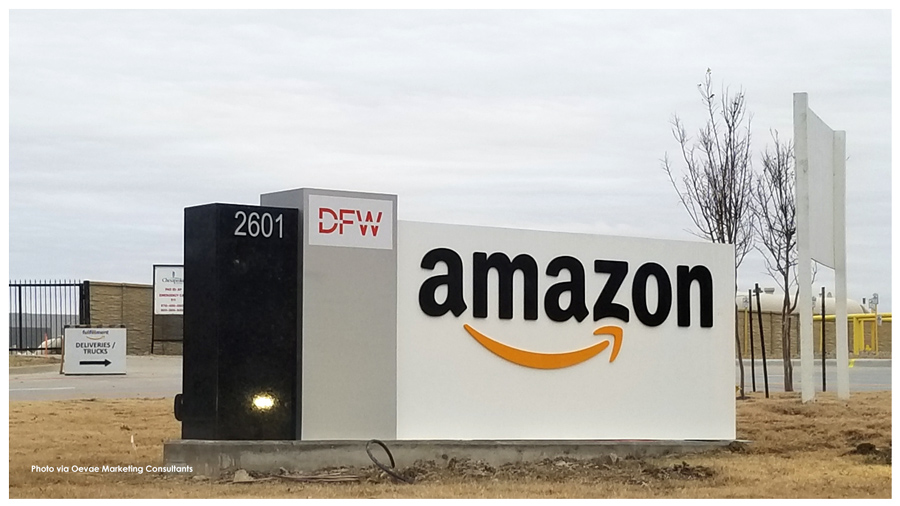
Amazon Fulfillment Center Tours 2601 W Bethel Rd, Grapevine, TX 76051


If you run a small business, chances are you’ve realized how tough it can be to compete with giants like Amazon. After all, customers who shop through major retailers can often find lower prices on a huge variety of products and have them at their door in no time. In that sense, it can feel like an uphill battle to attract new customers and retain the ones you have. 

However, your small business has an advantage that most retail behemoths don’t have: You can discover your niche and provide world-class products and customer service. If you embrace your brand personality and focus on catering to your niche in these ways, you don’t have to worry about offering the most products at the cheapest price. 


No matter what kind of products you sell, here are some practical tips to help you embrace your company identity and shine among the competition.


Use a Staffing Agency 


First of all, if you have a warehouse that isn’t running efficiently, you stand no chance of competing with companies like Amazon. Fortunately, you can fill positions by going through a staffing agency. If you need immediate help, consider using on-demand labor through a temp agency to keep your warehouse running well.  Finding quality labor can be done with an on-demand staffing app which gives businesses the power to find temp workers within minutes; this will buy you some time to find and hire the right full-time employees. Plus, another major perk of going through a staffing agency is that they can take care of payroll responsibilities. 


Provide Purpose


Many customers prefer to support companies that operate under a purpose that goes deeper than money. The purpose can be anything as long as it helps people. For instance, eyeglass manufacturer Warby Parker donates a pair of eyeglasses to someone in need for every pair they sell. If you already have a purpose, or once you find it, be sure to make it clear to customers (and potential customers) through your website, marketing, and product packaging. 


Focus on Product Quality


Customers won’t forget quality. While developing top-notch products can be one of the most challenging aspects of running a business, it can also carry some of the most weight in regard to solidifying your company’s reputation and sustaining long-term growth. Whether you make boutique light fixtures or dropship accessory items, make sure your customers are getting the best they can buy. They’ll definitely remember this trait going forward.


Inspire Customer Loyalty


If you want to retain customers, you must prioritize customer service. It’s now easier than ever for customers to quickly find another source to purchase an item if they’re unhappy with the customer service and support they receive from your company. Make sure your website clearly lays out your company’s contact information, and try to respond to customer inquiries and feedback — both positive and negative — as promptly as possible. 


Add Shipping Incentives


These days, shipping matters — a lot. If you don’t want a customer leaving your website because your shipping costs more and takes much longer than Amazon Prime’s two-day shipping, you need to revisit your shipping strategy. It may require an upfront investment, but it can ultimately make you more money. For instance, look at your budget and see if you can afford to offer free or discounted shipping on all products, or at least offer free shipping on purchases over a certain amount (e.g., $50, $100, etc.). 


It’s not easy to compete with Amazon and the like, but it’s possible if you use your small business format to your advantage. Consider going through a staffing agency if you’re experiencing warehouse problems. Make sure your company has a purpose that people can believe in, and focus on the quality of your products. 


Finally, prioritize customer service, and figure out a shipping strategy that appeals to customers. If you give customers a reason to choose your company over major competitors, they will. 


References


Andreanna McKee, Graphic Designer and Content Marketing Manager

The Right Way To Do Temp Hiring