

When customers are just getting to know a brand, that brand's messaging is critical. In addition to being aware of varying personal needs states, brands need to be aware of the broader world they (and their customers) live in.
"Awareness (mental availability) is the best path to customer acquisition, which is, in turn, the only true path to growth."
– Ehrenberg-Bass Institute
If we deconstruct a brand's messaging we can then take those parts to reconstruct perhaps an even stronger brand, and objectively gain a better understanding of what brands are saying to consumers. Similar to an autopsy of a human that uncovers the cause of death and brings knowledge that could prevent similar deaths in the future.
When you think about it, a brand often recognized by its logo can be broken down into three major parts (1) Colors, (2) Shapes, and (3) Words. Although there are some other factors used to fine-tune a brand such as a jingle, marketing channel, and voice. This article will focus on the prior.
Number One: Colors
color | ˈkələr (British colour) | noun
1 the property possessed by an object of producing different sensations in the eye
Let's take a look at how colors work together and how they influence your brand messaging.
The colors you choose for your brand set the tone, just as a red stop sign helps you identify the warning. If you don't stop and there is a collision, the next color you might see is flashing red lights, and when someone dies, the color black will be commonplace at the funeral. So, it's by association with real-life events that colors can be used to trigger human emotions like happiness, e.g., emoji yellow. All colors, like people, have negative and positive traits.
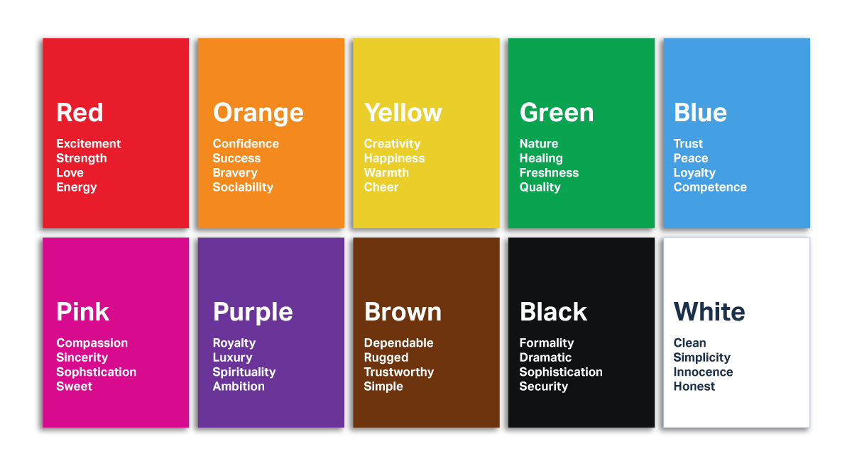
When you apply these colors to some of today's most popular brands (McDonald's, Starbucks, Walmart), it's clear why they use the colors they do and a better understanding of what colors you might consider for your new brand's logo.
Number Two: Shapes
shape | SHāp | noun
1 the external form or appearance characteristic of someone or something; the outline of an area or figure.
Let's take a look now at how shapes work together, and how they influence your brand messaging.
The shapes that you choose for your brand set the direction just as a straight line helps you identify a direction or a boundary. If you cross the solid line on a two-way road and there is a collision, the next line you might see is the zigzag line that records your heartbeat/pulse, better known as PEA (pulseless electrical activity), and if the some dies, the term "flatline" will be common in the ER (emergency room), thus, before the funeral. So, it's by association with real-life events that shapes are used to trigger human direction and outcomes. All shapes, like people, are made up of different curves and lengths.
It's common to see an "arrow" used for companies that offer solutions for growth. However, the hexagon is most like the single most common shape in nature, and one that most astounds mathematicians. Most labels on fruits and vegetables are oval or circles, which many of the most iconic brands (Mercedes, Target, ABC) in the world use. The circle is a universal symbol with extensive meaning – notions of totality, wholeness, perfection, and the infinite. Meanwhile, a heating and air company or swimming pool business often uses wavy lines to represent air and water respectively.
Shapes of your product are also commonplace in branding. For example, Play-Doh uses images that represent letters made of clay, while McDonald's "Golden Arches" resemble their World Famous French Fries®. Starbucks uses a Green mythological creature (a super mermaid) as the biggest symbol and the face of the brand, inspired by Moby Dick, which makes perfect sense for a coffee company's hometown of Seattle, a port city.
When thinking about the shapes your brand might use, you might ask yourself where "it" comes from, and what will "it" do for consumers? For companies that serve food, this may be pretty simple, but what shapes would a package delivery or pet supply business use?
Although the Interactive Advertising Bureau (IAB) which empowers the media and marketing industries to thrive in the digital economy predicts the rise in the volume of online orders and the consumer willingness to pay extra for fast delivery pushed the value of the Last Mile market to $31.2b in 2018, and the market is predicted to reach $61.6b by 2025. And, the Pet Supply CPG (consumer packaged goods) are growing the fastest online, we are not at liberty to tell you which shapes you should consider for your brand without being hired as your brand consultant.
Number 3: Words
word | wərd | noun
1 a single distinct meaningful element of speech or writing, used with others (or sometimes alone) to form a sentence and typically shown with a space on either side when written or printed.
Let's take a look at how a word can influence your brand messaging
The word that you choose for your brand name can reinforce and refine the color choice and shape of your logo. Using a short word is not only easy to spell, but it's also ideal because it tends to be very brandable and easy for consumers to remember aka catchy. Some of the most recognized brands (IBM, Hulu, Uber, Lyft) use as few as three or four letters, while others only a single letter (Google, Pinterest, McDonald's) to represent their brand's logo.
A backstory helps when thinking of words that represent brand names. One huge brand examples that come to mind are Sam's Club and Wal-Mart created by Sam Walmart.
"The key to greater productivity is to work smarter, not harder."
– Allen F. Morgenstern
Over two decades ago the founder of Oevae Marketing Consultants, Gibrón Williams set out to create a logo to represent the company. He chose "Oevae" – a derivative of the Yiddish word "Oy Vey" and what he calls, "the original OMG." He first heard of this Yiddish word through a close Jewish friend. Gibrón was a young artist, and aspiring entrepreneur looking for the best brand name that would embody the essence of his creativity. He had a strong desire for a unique and memorable brand name people would admire and one that is fun to say, a brand name that represented the creative ideas the company intended to produce for small businesses. His Jewish friend would cry out "Oy Vey" whenever Gibrón did something highly creative and unusual. So he decided to name the creative marketing company "Oevae" – a short word with only five letters.
Consider how and where your brand will be distributed or visualized by consumers. Will your logo be on a business card, t-shirt, merchandise, packaging, banners, brochures, and billboards? The combination of message and marketing channels can drive significant synergies that can boost the effectiveness of your marketing efforts for your brand.
"Marketing accounts for 10%-35% of a brand’s equity (visibility, such as seeing a product on the shelf or signage on a storefront and regular product usage)."
– Nielsen
Oevae logo designs use graphic messaging techniques to influence consumer perceptions with a broad reach because brand-building efforts are a lever to drive future sales. Given the prevalence of choice and access, staying top-of-mind with consumers could be the difference-maker when a sale is at stake. This increased pressure on non-marketing sources of equity elevates the importance of marketing in preserving a brand’s health. For more information or to get your brand design from oevae marketing consultants, visit oevae.com
Make a brand difference.™
No comments:
Post a Comment