
In this commentary, we'll explore how Remitly combines visual storytelling, color psychology, and practical messaging to introduce a more convenient customer experience. We'll also examine where thoughtful creative adjustments could make the campaign even more engaging.
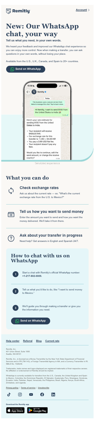
The email opens with a confident navy-blue headline, "New: Our WhatsApp chat, your way," immediately communicating its customer-centered purpose. Navy blue suggests stability, professionalism, and trust—valuable associations when discussing financial transactions. The pale aqua background introduces calmness and approachability, balancing the seriousness of money transfers with a welcoming presentation.
Three elements make this campaign particularly effective:
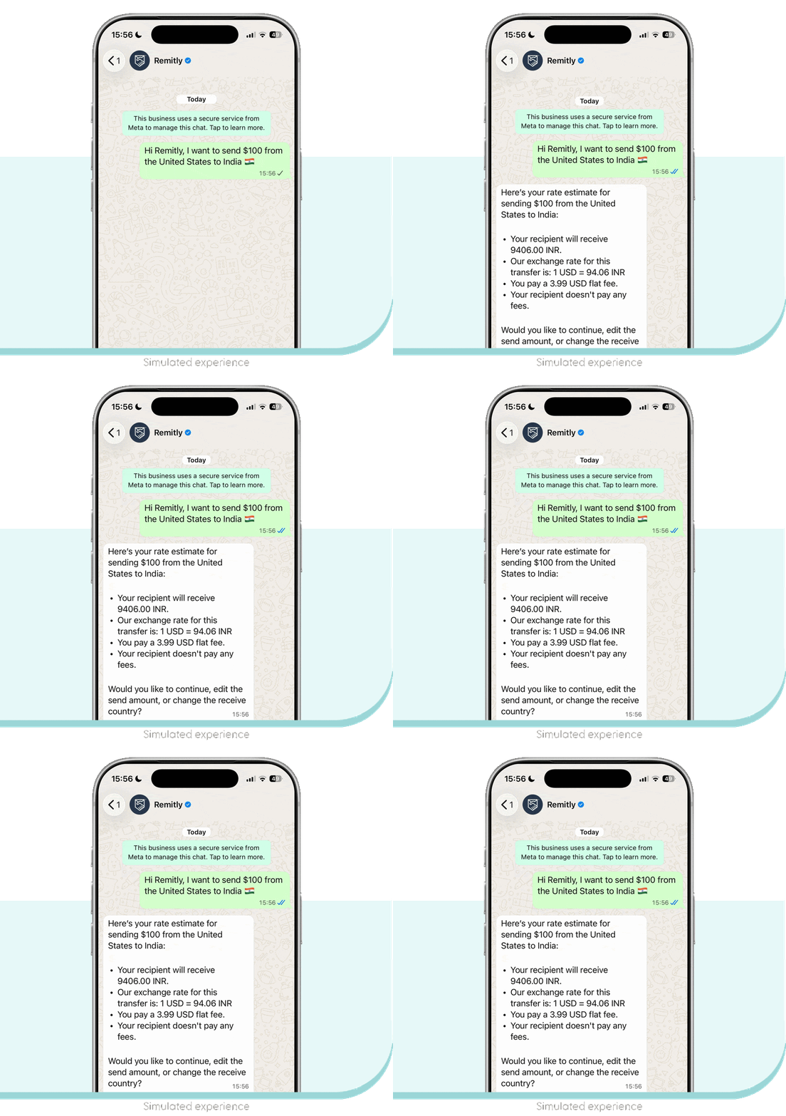
- Animation demonstrates the product. The smartphone and WhatsApp conversation illustrate how customers can communicate with Remitly rather than relying exclusively on written explanations. The movement helps attract attention while reinforcing the service's usefulness.
- Color psychology supports the message. Navy blue communicates reliability and professionalism, while pale aqua introduces a softer, reassuring atmosphere. Together, they help make a financial service feel accessible.
- The call to action reduces friction. "Send on WhatsApp" invites customers into a familiar communication environment rather than requiring them to learn an entirely new interface.
The supporting content is equally disciplined. Three practical benefits—checking exchange rates, arranging transfers, and requesting assistance—give readers enough information to decide whether the service meets their needs. Numbered instructions eliminate uncertainty without overwhelming the audience.
Where could Remitly improve?
- CTA visibility: The primary "Send on WhatsApp" button is relatively small. Greater visual prominence, additional spacing, or stronger contrast could help attract more clicks.
- Animation and interaction: A subtle progression through the WhatsApp conversation, emphasizing the customer's question and Remitly's response, could make the experience more engaging.
- Visual continuity: A small animated accent connecting the smartphone demonstration to the CTA could guide attention toward the next action without introducing unnecessary distractions.
One particularly smart decision is repeating the CTA after the instructions, giving readers another opportunity to engage once they understand the service.
Ultimately, Remitly demonstrates that successful animated email marketing isn't about movement for movement's sake. It's about using motion, design, and meaningful information to tell a complete story.
What have we learned?
Small businesses can benefit from demonstrating their services visually, choosing colors that support the intended emotional response, and making the next step unmistakably clear. The goal isn't simply to attract attention—it's to turn that attention into meaningful customer engagement.

No comments:
Post a Comment